Kiwi Finance - Onboarding - Project
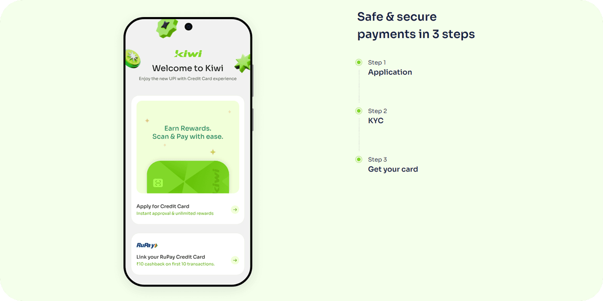
Kiwi Finance - A new way to pay that combines the benefits of a Credit Card with the convenience of UPI payments. Providing virtual credit card targeting young professionals with benefits and features.
Due to it's lengthy onboarding form, 30% drop rate of users are seen while filling up the form, Kiwi approach to give a solution for the onboarding process so that users drop rate reduced. Further also going through the entire form, so to make the process easier and quick.
Note: This is an industry project sponsored by ownpath. Any work done in the purview of this brief, under the guidance of ownpath staff and its partners, is considered ownpath’s intellectual property.
01
Problem Statement
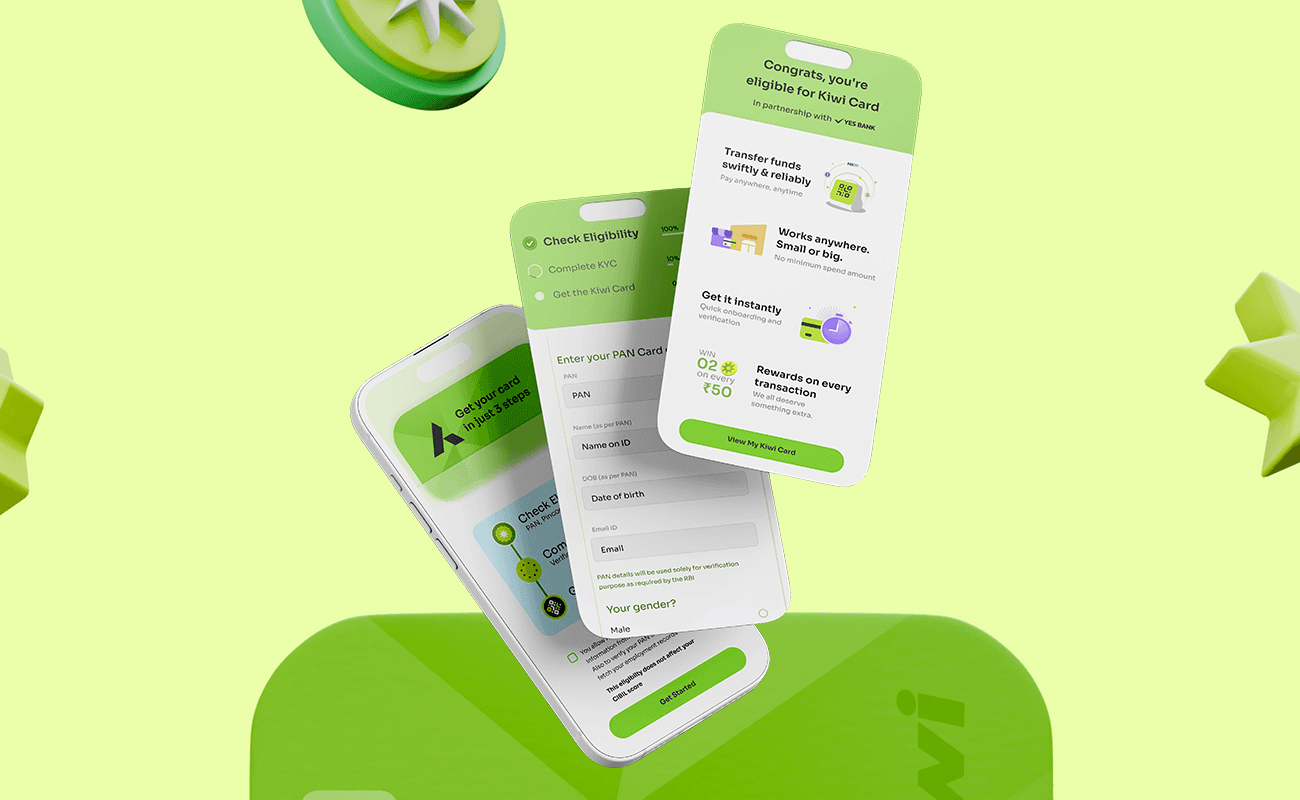
For Kiwi, on-boarding users to register on their app was a lengthy process, the form filled in by users had a drop rate of 30%.
Issues with the form:
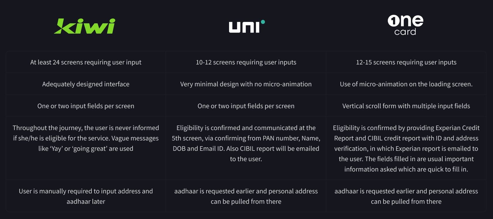
• At least 24 screens requiring user input
• One or two input fields per screen
• Throughout the journey, the user is never informed if she/he is eligible for the service. Vague messages like ‘Yay’ or ‘going great’ are used
• User is manually required to input address and aadhaar later
Insights from User & Stakeholder Interviews
- Quite lengthy form which is frustrating. I had to take a break and then I forgot about it’
- I am an interior decorator. None of this options matches my industry’
- Confusion regarding the question for relationship to a director has been noticed.
- The most important data that decides eligibility are PAN, Pin-codes and Country of user.
- I don’t know my exact office address - Can I just put the name of the area?
- How come Kiwi does not consider me eligible, when I have a credit score of 800+?
- Highest drop off or abandonment happens where users are asked about Work pin-code, Work address, and Relationship to Director.
02
Competitive Research & Analysis
After a Competitive Research with existing apps like UNI and One Card, the number of screens which takes in information and gives quick eligibility report (with the reports being sent to email of the user) of till date loan transactions, are very less screens compared to what Kiwi had for onboarding.
03
Solution
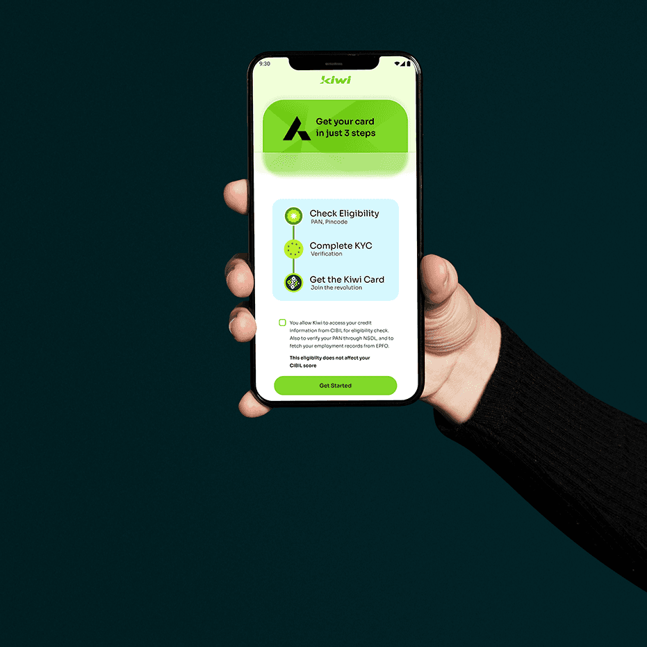
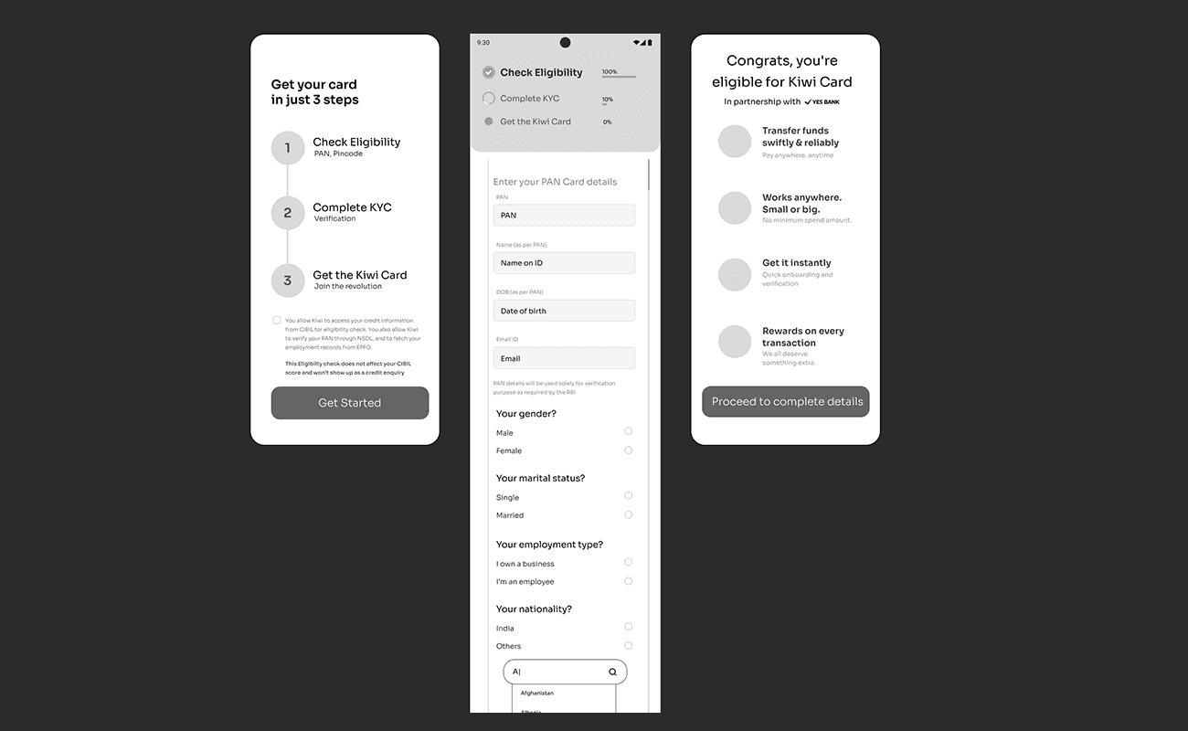
• Redesign the flow so information can be fetched through documents uploaded/ID shared, rather than user inputs as an option.
• Provide early confirmation to users about their eligibility of the service as a motivation to continue with the rest of journey.
• If possible, engage users by effectively communicating the features/value provided by the service at various intervals of the journey.
• Use a vertical scroll approach so number of fields can be know before hand by showing how much percentage of the form is being filled to make the journey quick and seamless.
• Fetching important user details like Mobile number, PAN, Name, DOB, Current Pincode, should be asked at the start of the onboarding process.
04
Learnings & Reflection
Insights
While presenting the journey on the overall onboarding, having a discussion with the design director at Kiwi, brought more insights as to what better approach can be done, from the start of this project, while to and fro questions on how end user was or is currently facing pain points while filling up the form, helped me in coming with various solutions.
Breaking the norm
As per Kiwi, they are following RBI guidelines to avail credit card, the filling up the details on the physical form at the bank, is what exactly kiwi was replicating to users to fill in on their app. Having same lengthy form on an Kiwi mobile app for onboarding might not be appropriate, as it is time consuming and there is assistance while filling up the details, user alone as complete the form, so why go through such long process, when it can be broken down fetching necessary details only?